A single tone is only a color, two tones are a chord, that is life.”
– Henri Matisse
One of the best ways of highlighting something is paradoxically to put it next to its complete opposite or diametric. According to Nietzsche, contrast is the idea that concepts only exist because their own antithesis exists. Think about it for a second, how would you see light if darkness didn’t exist? Or how would you enjoy the sun on your skin if it hadn’t been cold-damaged just before? And mostly, how would you appreciate other people and what they can offer you if we all were the same without differences, oppositions, or distinctions?
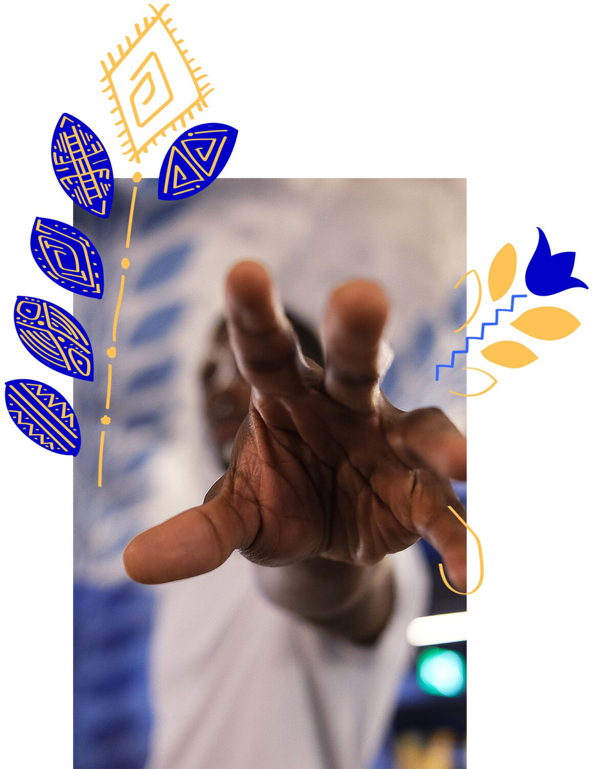
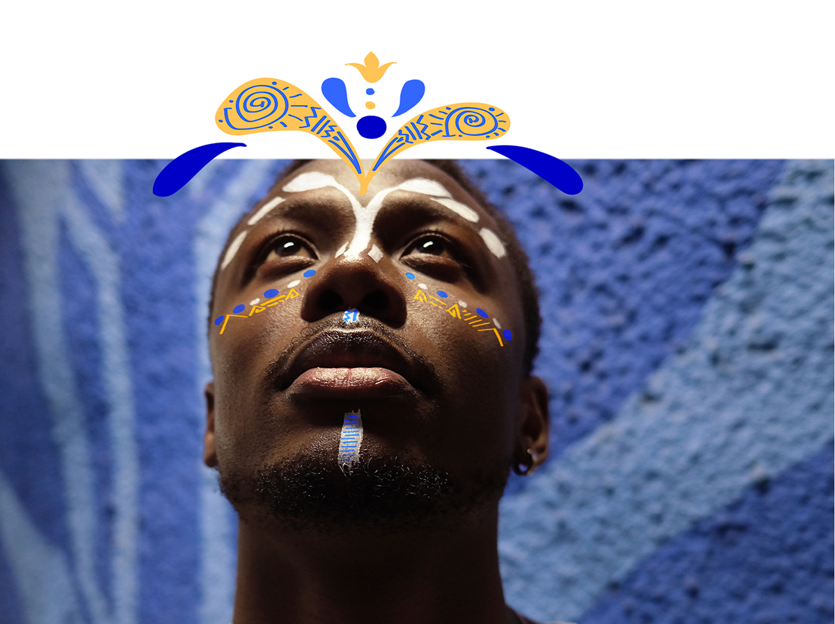
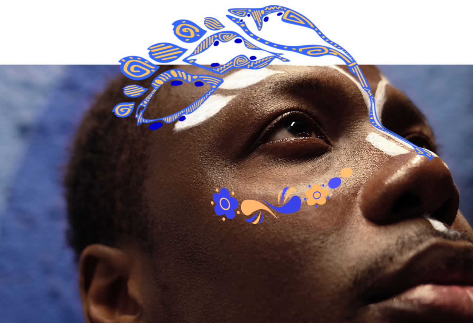
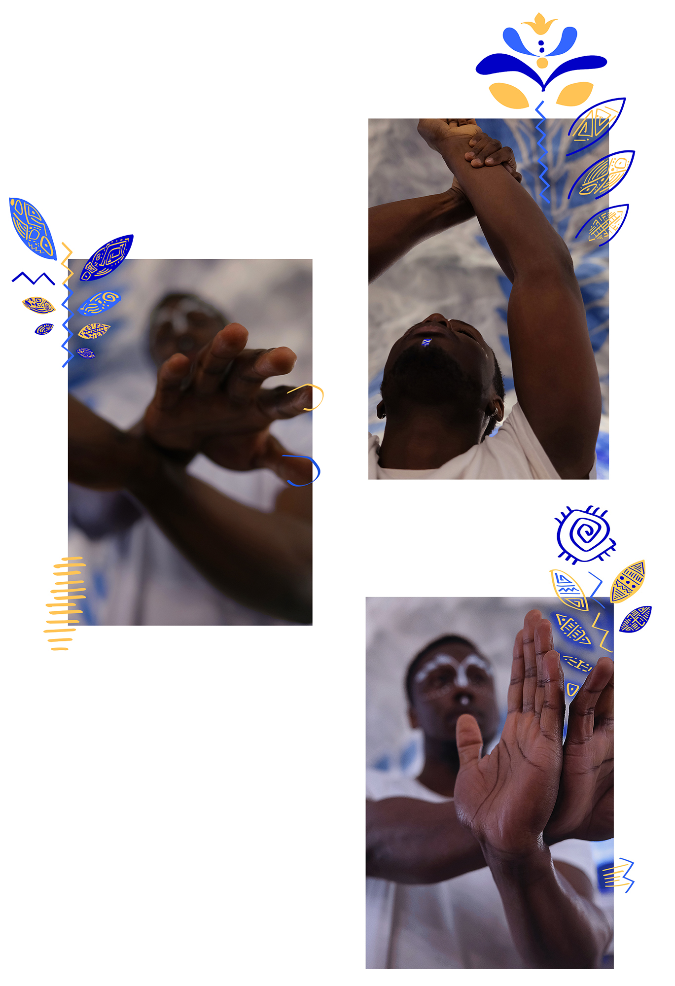
In this story, we’re highlighting that opposition and contrary can mean harmony if you shift your perspective. So please enjoy the light, the contrast, the opposition of the textures, the illustrations team-working with the photos, the colors complementing each other, the mix between African and Swedish patterns and culture…
After all, aren’t we just full of paradoxes?


model
photo illustrations
assistant photo/ layout
makeup
post-production
Henrik Aronsson @hndrxx.a
Jade Trinqué @jade_trinque
Louise Marinoff @louise.marinoff
Lila Simonot @lilayl_
Thomas Brunet
Lila Simonot @lilayl_


